
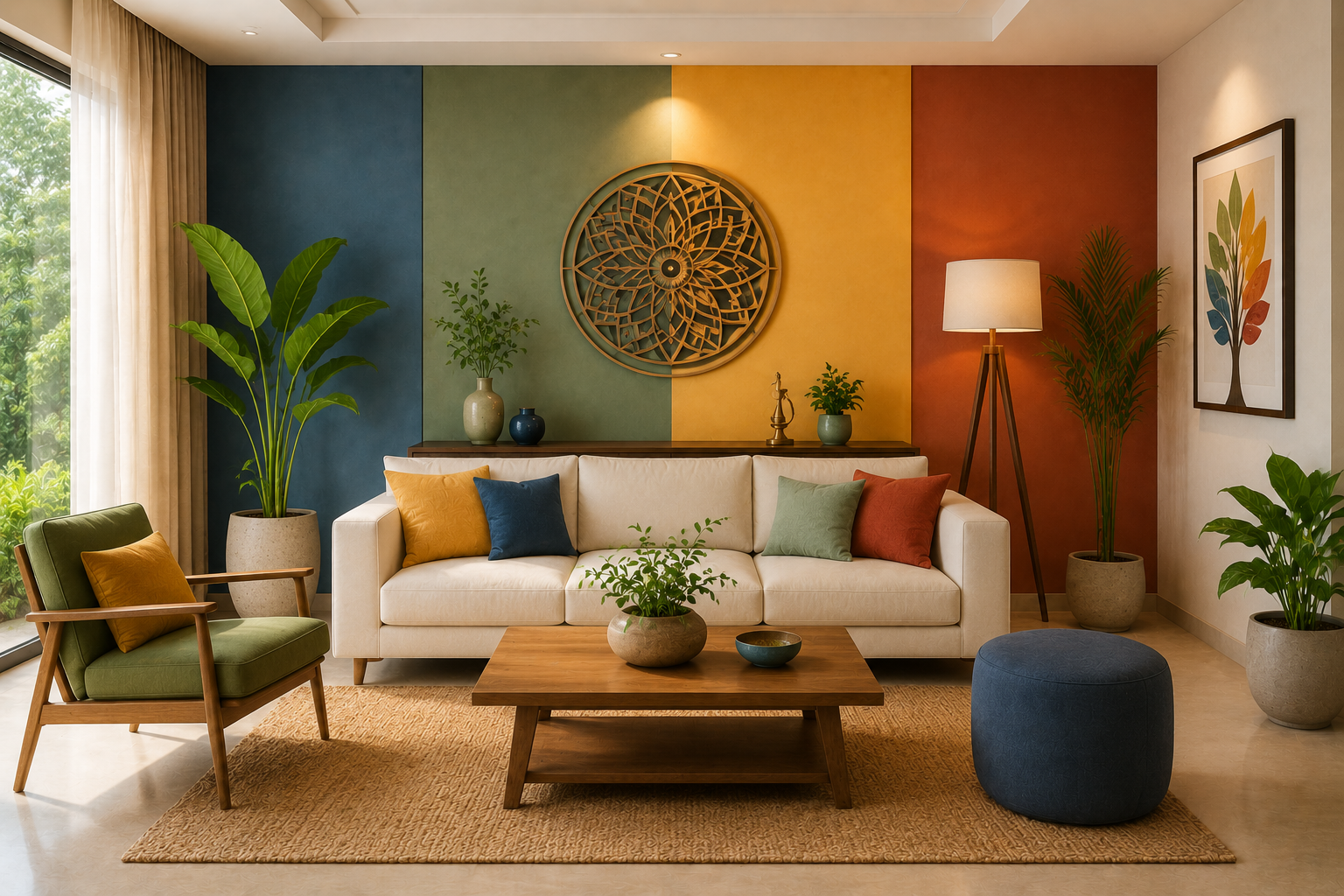
The Role of Colors in Vastu and Interior Design
The Role of Colors in Vastu and Interior Design
Colors have the power to influence our emotions, energy, and overall well-being. In both Vastu Shastra and interior design, choosing the right colors is essential for creating spaces that are not only visually appealing but also balanced, harmonious, and comfortable. While interior design focuses on aesthetics and functionality, Vastu emphasizes the flow of positive energy through color choices. When combined thoughtfully, they help create homes that are beautiful, peaceful, and uplifting.
✨ Why Colors Matter in Home Design
Influence Mood & Emotions
Colors affect how we feel every day. Soft, calming shades promote relaxation, while vibrant colors bring energy, creativity, and enthusiasm into a space.
Support Positive Energy
According to Vastu principles, each color carries a unique energy that can help create balance and harmony within different areas of the home.
Enhance the Overall Interior
The right color palette makes rooms feel brighter, larger, warmer, or cozier while complementing furniture, décor, and lighting.
🏡 Choosing the Right Colors for Every Room
1. Living Room
Choose warm neutrals, light beige, cream, soft yellow, or pastel green to create a welcoming and cheerful atmosphere where family and guests can comfortably gather.
2. Bedroom
Opt for soothing shades like light blue, soft green, lavender, or pastel pink to encourage relaxation, restful sleep, and emotional balance.
3. Kitchen
Warm colors such as light orange, peach, cream, or soft yellow create an energetic and inviting cooking space while maintaining brightness.
4. Dining Area
Earthy tones, light brown, warm beige, or muted yellow help create a pleasant environment that encourages family meals and conversation.
5. Home Office
Choose light green, muted blue, or soft white to improve concentration, productivity, and mental clarity.
6. Bathroom
White, light grey, pale blue, or aqua tones create a clean, fresh, and calming environment.
7. Prayer or Meditation Room
Soft white, cream, or light yellow enhances tranquility and creates a peaceful atmosphere for reflection and prayer.
🎨 Popular Colors and Their Meaning
White
Represents peace, purity, simplicity, and openness. Ideal for creating bright and spacious interiors.
Blue
Promotes calmness, trust, focus, and relaxation. Suitable for bedrooms, study rooms, and home offices.
Green
Symbolizes nature, growth, harmony, and balance. Perfect for living rooms, balconies, and indoor spaces with plants.
Yellow
Associated with positivity, happiness, optimism, and warmth. Works well in kitchens, dining rooms, and entryways.
Beige & Cream
Create timeless elegance, warmth, and sophistication while complementing almost every interior style.
Grey
Offers a modern, balanced, and sophisticated appearance when paired with lighter shades and natural textures.
Earthy Browns
Represent stability, comfort, and connection with nature, making them ideal for furniture and accent walls.
💡 Smart Color Styling Tips
Maintain a Consistent Color Palette
Use two or three complementary colors throughout your home to create a cohesive and harmonious look.
Balance Bold & Neutral Shades
Pair vibrant accent colors with neutral backgrounds to prevent rooms from feeling overwhelming.
Use Natural Light to Your Advantage
Observe how natural daylight affects your chosen colors before making a final decision, as lighting can significantly change their appearance.
Add Color Through Décor
If you prefer neutral walls, introduce color with cushions, rugs, curtains, artwork, and decorative accessories.
Match Colors with Materials
Combine color palettes with natural materials like wood, stone, linen, cotton, and plants to create warm, inviting interiors.
🌿 Vastu-Inspired Color Suggestions
- North Direction: Green for growth and positivity.
- East Direction: White or light blue for freshness and new beginnings.
- South Direction: Soft red, terracotta, or earthy shades in moderation for strength and confidence.
- West Direction: Cream, beige, or light grey for stability and comfort.
- Northeast: White, cream, or light yellow for peace and spirituality.
- Southeast: Soft orange or peach for warmth and positive energy.
- Southwest: Beige, brown, or earthy tones for stability.
- Northwest: White, light grey, or pastel shades for balance and harmony.
Conclusion
Colors are one of the most powerful elements in both Vastu and interior design. They influence emotions, enhance the beauty of a space, and contribute to a balanced and harmonious home. By selecting colors thoughtfully and combining Vastu principles with modern design aesthetics, you can create interiors that are not only elegant but also comfortable, uplifting, and full of positive energy.
Ready to Transform Your Home with the Perfect Color Palette?
At Build Your Space, we combine Vastu principles with contemporary interior design to help you choose colors that enhance both beauty and positive energy. From selecting the ideal wall shades to coordinating furniture, décor, and lighting, our expert designers create spaces that are stylish, balanced, and perfectly suited to your lifestyle. Let us help you bring harmony, elegance, and timeless charm to every room in your home.